
Design case – My Randstad App
“Yes, very nice animation, but too much effort for devs to create; we put it on the backlog for later”.
Most of the time, this will happen during the sprint refinement. This is because most design tools can create detailed animations that look fantastic but are not ready to use by the devs. During my project working on the Randstad Global App, we wanted to add some animation for the feature Punch-Clock. We were creating the app for Android and iOS, both different codes, so it doubled the effort. It was a no-go for devs to create the animation. So we created the animations in Adobe After Effects, and by using the Lottie plugin, you can create ready-to-use animations.
Why the animation
We wanted to add extra attention to the moment you start and end the punch clock and to show that the punch clock was active. Because the active time recorded during the punch clock is the time the user gets paid for, they need to see it is active so they don’t have to focus on technicality and can do their jobs without stress.
Using insights
This punch clock feature already worked on the old app as a try-out. From that data (from users and planners), we got many insights from the user and with the technical boundaries, we had a good idea of how to improve the feature.
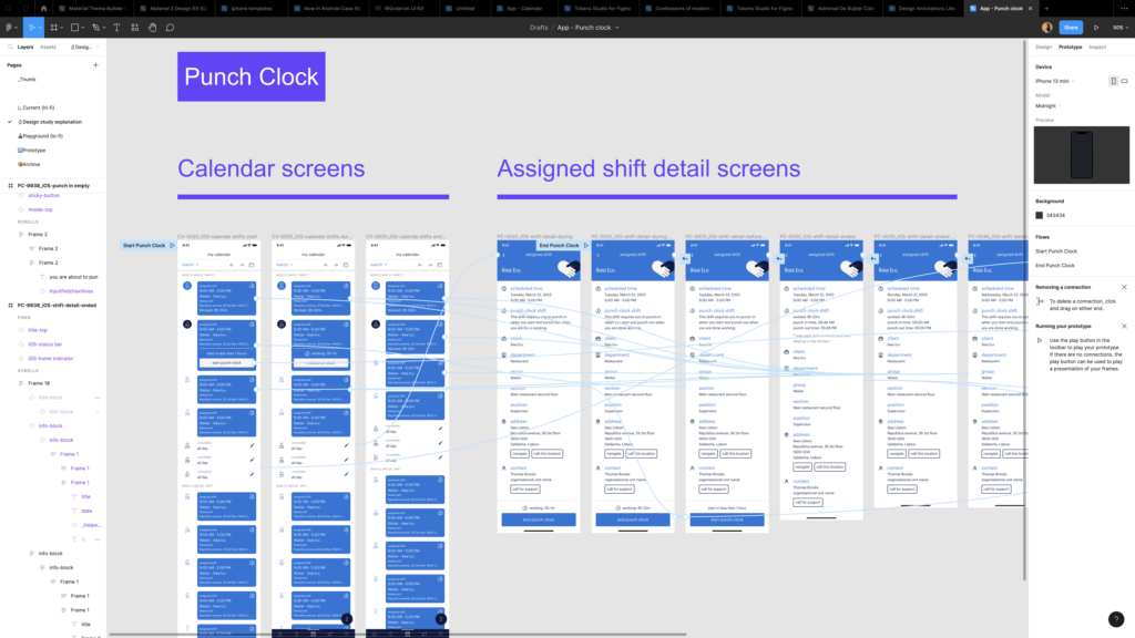
Our solution
With insights into job-to-be-done and technical boundaries, we created flows, wireframes and prototypes. We added an extra step in starting and stopping the punch clock to ensure the user did not accidentally push the button. But we kept the task fast and easy to do. To indicate that time was running next to the time stamp, we showed an animation icon so it was apparent to the user that it was active. Because Randstad’s brand style has a lot of simple but lovely illustrations, we created a small, fun animation that shows a hand pushing a button. This is shown on the extra step to start or stop on Punch-Clock.
The launch
We did some testing with a clickable prototype with Figma and did some tweaking on the copy. We delivered high-res designs for both platforms in Figma, and all our UX decisions, test, flow and annotations were documented in Confluence. And, of course, the .json file was included for devs to be implemented in the code.
Impact
We had lovely feedback from the end users. We improved the trust and made it comfortable for the user by adding small animations and the extra acknowledgement step before activating the Punch clock. Also, for the planner, the improvements were a great success because there were fewer mistakes he had to correct.
Continue creating animations for the app
The process of delivering the animation with development was so smooth that we decided to add more. We also created this loading animation. It indicates the transfer time that was needed to get your old data into the new app. This version is styled in Tempo-Team colours.
What I learned
Keep working on improving the user-friendliness of your product. Small extra changes can make a huge difference. Learning and creating the animation was fun, and seeing them in the final product. It does not affect the app’s performance because it is Json-based animations.